Pages

Thursday, October 17, 2013

Other Art 1: Bean Bags


Size: Bean Bag Regulation Size
Materials: Wood, Acrylic Craft Paint (not my good paints!)
Artists: Me, My Brothers, My Dad, My Grandma, [and my Mom and my Dog for moral support]
Time: Finished in early June, took a couple weeks

So, I'm at college now, and I haven't completed any art projects yet [three on the way :D] so I went back to a project I meant to post a couple months ago.

I decided to include these on my blog, as they are indeed works of art of a sort, and a family production at that. For my high school graduation party, my family decided to make two sets of bean bag boards. Two boards are painted in the University of Iowa colors for my bro, and the other two boards are Purdue for me. My brothers and my dad constructed the wooden frames and painted the base coat [beige or yellow]. My dad painted the black boarders and the lettering. I only painted the emblem [which makes my family's awesome workmanship look even more awesome]. And my grandma sewed the super cool, professional Iowa and Purdue bean bags. My mom and my puppy provided moral and emotional support (as well as refreshments ~ thanks mom!). I used cheap craft paint which my dad sprayed a clear varnish over to protect the logo. For the Iowa symbol, I created a paper stencil to transfer the logo on. For Purdue, I used a graphite transfer (not using actual graphite sheets but spending a good 10-15 min. scribbling in pencil on the back of the logo paper I printed). These bean bag boards turned out super awesome, and everyone at the party loved them. I'd like to thank everyone who helped make these. You all did awesome work, and it really helped make my party special! :)

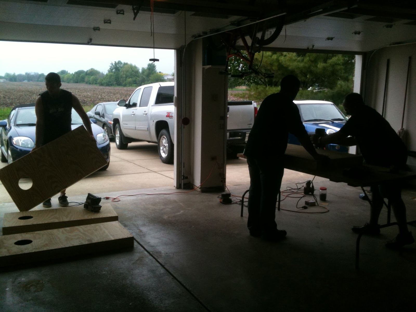
The picture above shows the men of the family working hard to construct the wooden frames for the bean bag sets. Might I add that they look super mysterious working in silhouette~

Here are the bean bags that my grandma made for our sets. She did a really great job!

Here's the first of the two Purdue logos I did. Finishing the first one felt awesome, and it looked sweet! Also by spending all that time painting the logo of my new school, I really got to know it well. Now every time I see the boilermaker logo I feel a bit of a deep connection, not to mention the fact that I pretty much have everything in its layout memorized (which doesn't sound too impressive, but it is a pretty complicated logo, especially compared to Iowa's). [Side note: you can see my cheap craft paints]

And here's both of the Iowa boards. They look awesome.

[Side note: Both the beige and yellow paints were old house/room paints that my dad wanted to use up. We found the perfect project to do just that :) ]


Saturday, August 10, 2013

Painting 6: 25th Anniversary


25th Anniversary
19 in. x 15 in.
Acrylic
June 2013

I painted this picture for my parents for their 25th anniversary. In it I meant to clearly display both of their rings, and their hands are holding a blue glass ball that they found on a beach in Hawaii on their honeymoon. This piece was a lot of fun. I approached it the same way I approached the Ugli Fruit painting only the subject matter of this piece (the two hands) was much more complex (than the ugli fruit). I really learned to love acrylics while doing this piece. The background was originally supposed to be the sand on a beach but due to acrylic inspiration and lack of time I went for a more simple and dramatic background. First I painted the background gray darkening to black around the edges and colored with either green or red for extra dramatic effect. Before I had begun painting I had primed the illustration board with matte medium, but instead of neat little strokes I had put the matte medium on in heavy swirls to give the piece a unique texture. Later I dry-brushed some of my darker paints over the texture which gave the background a really cool effect (that can't really be seen in the digital picture...). This was also my fastest painting ever; I whipped this little piece out in about a week!

Piece in Progress: 
(Not a very organized beginning approach, but was a lot of fun; - the idea for the green and red tinted background began when I was priming the board with matte medium and a little bit matte medium spilled into my phthalocyanine green in my palette. I happened to run out of matte medium and had to resort to salvaging the matte medium that spilled into the phthalocyanine green hence the rough green strokes in the background.)

(and I love mixing phthalocyanine green together with red to create a deep purplish color, thus the idea for the dark slightly red and green tinted background)


HAPPY SILVER ANNIVERSARY MOMMY AND DADDY!!!

Wednesday, May 15, 2013

Art Show 2: Lincoln-Way West Show

05/15/13 Today I went to the Art Show at Lincoln-Way West! It was awesome! All of the work was fantastic!

 My "Waiting For a Tow Truck" piece won an award of excellence for painting.

My Hand painting also won an award of excellence for painting.


 This is a picture of my painting (At Dinner in Galena) with my lovely mother who is the subject of the painting standing next to it.
And my Caramanico-Terme painting was honored with Best of Show!!!
This was a great night. Thanks a ton to the Lincoln-Way West Art Department especially Mr. Faris. And Congratulations to all of the people who had work in the show!

Tuesday, May 14, 2013

Painting 5: Ugli Fruit

Ugli Fruit - 05/09/13
Medium: Acrylic on canvas
Size: around 16x20in
Reference: The Ugli Fruit at Mariano's (the grocery store)
Time: Way too long :)
The assignment for this piece was to make something ugly artistically beautiful. I took this literally and painted a couple Ugli Fruit that I found at our Mariano's grocery store. I did this piece in acrylic and it was very difficult, but I've come to really enjoy the medium. This was also my first time ever working with canvas which I found to be a very challenging material that needs a lot of paint. I've been working on this piece for months and it is finally finished. Though at first I was not too enthusiastic about this project, I really came to enjoy painting it. I especially loved adding in all of the background detail. I had the most fun painting the transparent plastic sign holders. The hardest part of this piece was doing the lettering on the sign. This piece is currently displayed at my school's end of year art show.
Piece in Progress:


Wednesday, May 1, 2013

Art Show 1: 4x5 show at Fremd High School

Today I went to the 4x5 show at Fremd High School. It was pretty awesome; I loved all of the little art. It amazed me how good art could be even when it's confined to a 4x5 in. space. As I mentioned in a previous post, my 4x5 in. hand painting was honored with first place in the painting section! This is really exciting, because I've never received any sort of "place" medal (1st place, 2nd place, etc.) for art. Anyways I have some pictures from the show which include a distorted glimpse of the colored version of my hand drawing.


The above picture is my hand painting displayed on a television screen.


The above picture is my hand painting! It is tilted and it has a glare, but that was the best picture I could get. I'll take a better picture when I get it back. See the blue star on the name label? That indicates my first place! :D


And this is my plaque! I also received a Blick giftcard!!! ~And I bought a t-shirt for the exhibition.

The art exhibition was awesome. I feel very honored to have participated. Thank you very much to the Fremd high school art department and all other people who helped sponsor and/or run this event.

Tuesday, April 16, 2013

Newsflash! 2 - 4x5 painting

I am happy to announce that my 4x5 hand painting won first place at the 4x5 competition in the painting category. I will post a picture of the completed painting once I get it back from the competition (an uncompleted [grisaille] version of it is under Painting 4).

Thursday, February 14, 2013

Painting 4: Hand


Hand, 4x5 in.
02/14/13 - Acrylic, Grisaille
This is my finished grisaille of my brother holding a glass ball that my parents found in the ocean on their honeymoon. This is a little painting, just a 4 by 5. Next I need to glaze over it in color.

Piece in progress:

Saturday, February 9, 2013

Newsflash!: An article about me (from October)

This was an article about me, my knitting, and other activities I do.

See pdf scan here

Or read article here.

Old Pictures 3-5: Colored Pencil

Concerning Colored Pencil: To this day there are only three materials I like to use, and of those two are paints. The third is colored pencil. Though it was once my most hated art type, now it is my favorite, and my progression through colored pencil can mostly (besides for the horrid practice pieces I can not bear to ever look at again) be seen in the following three pictures, my first three Prismacolor colored pencil pieces:

Old Picture 3: Christmas Ornaments
12/2009

This picture does not do this piece justice; it is even worse than it appears here - much much worse. I did not know what I was doing; I did not understand the concept of layering colored pencils; I did the entire piece with no more than 15 different colors (a 12 pack plus Tuscan Red, Indigo Blue, and Cream). I am just proud that I was able to draw all of those ornaments (drawing is my weakpoint, I speciallize in shading and coloring) and finish the piece.

Old Picture 4:
Colored Pencil with Watercolor Background
2009/2010


I did this piece after I bought my 36 pack of Prismacolor colored pencils, and I finally started understanding how to use colored pencils.

Old Picture 5:
Colored Pencil
Summer 2010

 
Suddenly everything made sense...


Though this is not a perfect piece and I rushed the right side and the background, after doing this piece I felt invincible in the world of colored pencil... and since then I have understood that I can still be much much better.

This concludes my highlights from my history of Drawing I and II.


Old Pictures 1-2: Charcoal

Old Picture 1: Koi
Pen, Pencil, Charcoal
10/13/2009 from Drawing
Honorable Mention at Scholastic Competition (I think; it was either this one or Old Pic 2 below)
Award of Excellence at Joliet Junior College Art Competition (2009)


This piece was my first experience with charcoal and pen. I did all of the stippling in one night... I will never do that again. Unfortunately I do not have a good picture of the finished product; the best I have is the one directly above which blatantly compares my piece with the reference photo. When I did this piece, I did not really get it. All I saw was a fish. But now I really like it. He is not just a fish; he is MY fish!

Old Picture 2: Portrait
Charcoal
04/25/2010
Drawing II

(After doing this piece, I do not think I will ever use charcoal again... or for at least a long time)